Unified Learning Archive
Python Expense Dashboard Tutorial
"A legacy that will echo till eternity"
Built by Group 5 • Powered by Elona • Honoring NITDA/NCAIR 🇳🇬

Python Expense Dashboard Tutorial
"A legacy that will echo till eternity"
Built by Group 5 • Powered by Elona • Honoring NITDA/NCAIR 🇳🇬
Transform your receipt data into insightful visualizations with Python and Matplotlib
This tutorial will teach you how to create an automated expense dashboard that:
expenses.csv file generated by the Receipt Managerimport csv
from collections import defaultdict
import matplotlib.pyplot as plt
class ExpenseDataLoader:
"""
📊 This class loads and organizes data from the expenses.csv file.
"""
def __init__(self, csv_file='expenses.csv'):
self.csv_file = csv_file
self.category_totals = defaultdict(float)
def load_data(self):
"""
Reads the CSV and calculates the total price for each category.
"""
try:
with open(self.csv_file, 'r') as file:
reader = csv.DictReader(file)
for row in reader:
category = row['Category']
price = float(row['Price'])
self.category_totals[category] += price
except FileNotFoundError:
print(f"❌ File not found: {self.csv_file}")
except Exception as e:
print(f"⚠ Error reading file: {e}")
return self.category_totals
class ExpenseDashboard:
"""
📈 This class handles chart creation and display.
"""
def __init__(self, category_totals):
self.categories = list(category_totals.keys())
self.totals = list(category_totals.values())
def show_bar_chart(self):
"""
Creates and shows a bar chart of expenses per category.
"""
plt.figure(figsize=(10, 6))
bars = plt.bar(self.categories, self.totals, color='skyblue')
plt.title('Total Expenses by Category')
plt.xlabel('Category')
plt.ylabel('Total (₦)')
plt.xticks(rotation=30)
plt.grid(axis='y')
# Add labels on top of each bar
for bar in bars:
yval = bar.get_height()
plt.text(bar.get_x() + bar.get_width()/2, yval + 5, f"₦{int(yval)}",
ha='center', fontsize=9)
plt.tight_layout()
plt.show()
def main():
print("📊 DASHBOARD VIEWER")
print("🔁 Designed by Nuhu @ NITDA/NCAIR\n")
# Step 1: Load data
data_loader = ExpenseDataLoader()
totals = data_loader.load_data()
if totals:
# Step 2: Create chart
dashboard = ExpenseDashboard(totals)
dashboard.show_bar_chart()
else:
print("⚠ No data to display.")
if __name__ == "__main__":
main()receipt_manager.py to process your receiptsdashboard.py in the same folderpython dashboard.pyResponsible for loading and preparing the expense data from CSV.
Sets up the CSV file path and prepares a dictionary to store category totals.
Reads the CSV file line by line, sums up prices by category, and handles potential file errors gracefully.
Handles the visualization of expense data.
Prepares the category names and totals for visualization.
Creates a professional bar chart with labeled bars, proper formatting, and Naira currency symbols.
The main() function runs when you execute the script.
An ExpenseDataLoader instance reads and processes the CSV file.
Category totals are calculated and returned as a dictionary.
The ExpenseDashboard creates and displays the bar chart.
A window pops up showing your categorized expenses in a professional chart.
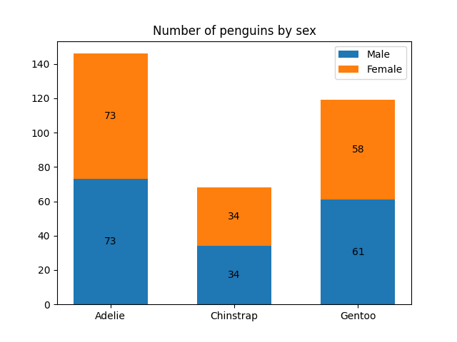
When you run the dashboard with sample receipt data, you'll see a professional chart like this:

Example of a professional bar chart generated by Matplotlib
Two-line explanations so any Group 5 member can understand and explain confidently
Reads and organizes your expense data from the CSV file.
It adds up all purchases in each category (Food, Personal Care, etc.) automatically.
Prepares the system to read your expense file.
Creates an empty "calculator" to track category totals.
Goes through each purchase in the file line by line.
Adds each item's price to its category's running total.
Turns numbers into visual charts you can understand at a glance.
Creates professional bar charts showing where your money went.
Organizes the data for charting.
Separates category names from their total amounts.
Draws the actual bar chart with colored bars.
Adds labels, titles, and Naira amounts for clarity.
The "conductor" that runs everything in the right order.
First loads data, then creates the chart, just like following a recipe.
This is where the program starts when you run it.
Like pressing the "ON" button to begin the whole process.
Now you can explain this dashboard like a pro! 🎤
Complete explanation in plain English for absolute beginners
import csv
from collections import defaultdict
import matplotlib.pyplot as pltThink of these like kitchen tools - each has a special job for our recipe.
def __init__(self, csv_file='expenses.csv'):
    self.csv_file = csv_file
    self.category_totals = defaultdict(float)
In Simple Terms: This sets up our "data calculator":
Like preparing a blank notebook before taking inventory.
def load_data(self):
    try:
        with open(self.csv_file, 'r') as file:
            reader = csv.DictReader(file)
            for row in reader:
                category = row['Category']
                price = float(row['Price'])
                self.category_totals[category] += price
Step-by-Step:
Real-world example: Like sorting receipts into piles (Food, Toiletries) and adding each pile's total.
def __init__(self, category_totals):
    self.categories = list(category_totals.keys())
    self.totals = list(category_totals.values())
What Happens:
def show_bar_chart(self):
    plt.figure(figsize=(10, 6))
    bars = plt.bar(self.categories, self.totals, color='skyblue')
    plt.title('Total Expenses by Category')
    plt.xlabel('Category')
    plt.ylabel('Total (₦)')
    plt.xticks(rotation=30)
    plt.grid(axis='y')

    for bar in bars:
        height = bar.get_height()
        plt.text(bar.get_x() + bar.get_width()/2, height + 5,
                f"₦{int(height)}", ha='center')
Chart Creation Steps:
Like an artist carefully labeling a graph for a school project.
def main():
    print("📊 DASHBOARD VIEWER")
    print("🔁 Designed by Nuhu @ NITDA/NCAIR\n")

    data_loader = ExpenseDataLoader()
    totals = data_loader.load_data()

    if totals:
        dashboard = ExpenseDashboard(totals)
        dashboard.show_bar_chart()
    else:
        print("⚠ No data to display.")
How Everything Connects:
Pro Tip: This is like the "start button" that runs the whole process in the right order.
Test your knowledge with these 30 essential visualization questions